|
|
Post by Koach on Jan 31, 2008 22:11:23 GMT -6
Okay. I am really liking this logo. The only problem is...it looks more like the logo for a Japanese Sushi Restaurant than an Anime Otaku website. T_T  Joe and I tossed around this idea last night and I just started doing it. I wanted to finish it once I started, even though I knew it didnt capture what I was looking for. Now I admit...I MAY have went a little overboard with the blur tool. I just didnt think it looked that good all crisp and sharp so I ran over it twice with blur. Well, I like the concept...but I feel as though it should be MORE anime like...you know? So..I guess anyone with photoshop skills can run with this...or post your own idea. Anyways, I am going to post the sample review this weekend. I needed to think of a good graphic layout to put the word with. More to come.... |
|
|
|
Post by Koach on Jan 31, 2008 23:03:05 GMT -6
OKaaay. So for some reason I was able to churn this out in 25 minutes. If you read back to my original post about the site, this was the logo I had envisioned....sort of.  Still not SUPER anime-like...but this one is fun. I REALLY want that big black O in the middle to be out mascot, Toki. Like I said before...the cabbit/blod/kirby/kitty kinda thing. I have a sketch of him I will scan tomorrow and post. Would look tight if we could squeeze Toki in there! |
|
|
|
Post by Zyren on Jan 31, 2008 23:59:08 GMT -6
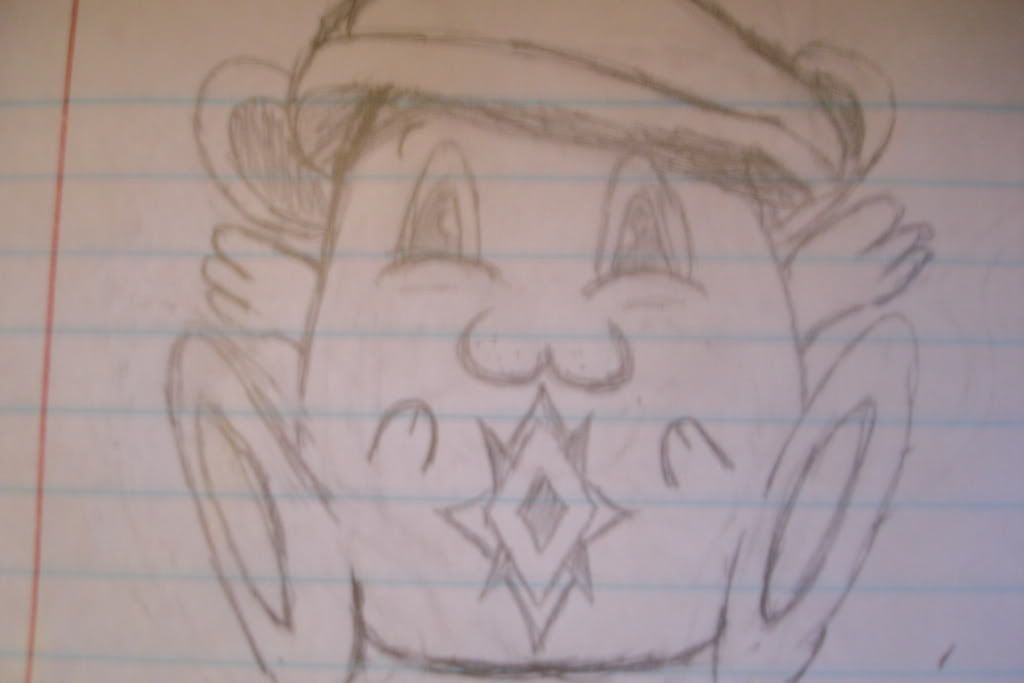
I drew this picture a few mins. ago and thought I'd share it. I know you asked for something cutesy, so I thought of something like that and came up with this. I thought of a different compilations of cute little anime characters and combined some of them together. *Note the Mokona round body style from Tsubasa Chronicles* I don't really like the hat too much...but its just something that I made up real quick like I said. I tossed in the wings just for kicks. And the symbol is just a trademark symbol that I use. Like I said, its just a thought and I wanted to share it, thats all.  |
|
|
|
Post by Zyren on Feb 1, 2008 0:00:03 GMT -6
Im already working on something thats more serious. Like something that'll put the testosterone in Tokyotaku
|
|
|
|
Post by Sanjitsu on Feb 1, 2008 5:03:02 GMT -6
Make it cutsey...Cute mascots are always a plus...Whether it's Timcampy, Pikachu or the jello drops from Dragon Quest. I like the concept of the logo, now if we had a cute mascot to hang off the big "o" then I think it would be a perfect idea.
|
|
|
|
Post by Koach on Feb 1, 2008 16:27:25 GMT -6
Here's the one I did...  |
|
|
|
Post by llael on Feb 1, 2008 19:15:25 GMT -6
|
|
|
|
Post by llael on Feb 1, 2008 20:27:23 GMT -6
 Ideassssss. =D Ideassssss. =D
Tell me what to draw?
I wannnnna help! |
|
|
|
Post by Koach on Feb 1, 2008 21:02:37 GMT -6
Cute and cuddly!! GJ Sammy!
|
|
|
|
Post by Zyren on Feb 1, 2008 21:07:25 GMT -6
I like the first fox! Its cute. Now it just needs the heart in the claw, blood drippin down its mouth, and the human carcass with its intestines showing.
|
|
|
|
Post by Sanjitsu on Feb 2, 2008 5:04:56 GMT -6
Nice drawing, but foxes are too girly IMO. Needs to be "anime" cute. Ummmm...Jiggly puff cute...Chopper cute...Mokona cute  (Chopper)  (Mokona) |
|
|
|
Post by suisid3l on Feb 2, 2008 17:09:43 GMT -6
I think they all look damn good, but the first one def.
|
|
|
|
Post by RiCEADDiCTBOY on Feb 3, 2008 22:52:11 GMT -6
been trying to msg you josh...had a logo for you but guess you don't want it. laters.
|
|
|
|
Post by Koach on Feb 3, 2008 23:02:42 GMT -6
lol...been gone man. way to QQ. why not just post it on the board like the rest of us.
Anyways, we have a photobucket you can upload to
u/n: bravehearts_ftw
p/w: boobies
|
|
|
|
Post by RiCEADDiCTBOY on Feb 4, 2008 0:13:32 GMT -6
NAW ITS COOL. LATERS. GOING TO SLEEP.
|
|
|
|
Post by Koach on Feb 4, 2008 12:22:37 GMT -6
Well upload what you've got tonight. I would like to be able to have a definite logo concept by the end of the week so we can run with that and put it into photoshop. Any more sketches of what our mascot will look like would be nice as well.
Also, I totally spaced this weekend (too much DotA) and didnt get my review posted. Once I do though, anyone who wants to consider writing for the site will need to do one as well.
|
|
|
|
Post by Kono on Feb 4, 2008 12:47:12 GMT -6
That choose an anime episode so we can all review the same thing? Or do you want us to choose whatever we want?
|
|
|
|
Post by Koach on Feb 4, 2008 13:15:02 GMT -6
episode??? lawlz...any of us should be able to do any episode review/synopsis in our sleep.
Im talking about a full series review.
The hardest part of this is remaining some what "spoiler free"
Anyways...you can do whatever series you want. I am doing mine on "Tengen Toppa Gurren Lagaan"
|
|
|
|
Post by Sanjitsu on Feb 4, 2008 13:37:05 GMT -6
I'm going to stick to writing reviews on anime I'm currently watching, that way my memory is fresh and I don't sound cheeky or judgemental towards many aspects I may have forgotten. Whenever the site is actually "official' I'll start downloading and watching the full animes like "Fate/stay night" and what not in order to write a more fulfilling review.
I can DEFINITELY do one on Busou Renkin though...That anime went from Awesome to awful so quick that my memory won't let me erase it.
|
|
|
|
Post by Kono on Feb 4, 2008 14:28:46 GMT -6
But we're doing the website "Episode by Episode" on the new stuff, right? So why would we right full series reviews? Or even reviews on older stuff?...
I haven't started Persona yet. I'm gonna watch 1-5 sometime this week / by weekend and see what I can write up. I have a speech to write as well as a 3-4 page essay for English though, so I may not get around to it ASAP.
|
|
|
|
Post by Zyren on Feb 4, 2008 16:10:37 GMT -6
Ouch
|
|
|
|
Post by Koach on Feb 4, 2008 19:42:06 GMT -6
Just made some sketches...ill post them tomorrow. Kinda excited about them. Let me know what you guys think when you see them.
|
|
|
|
Post by Koach on Feb 4, 2008 20:01:32 GMT -6
heres a quick tip...take those pictures you took from your camera...open illustrator and use the tools. you could just easily use illustrator and "trace" those images and manipulate and refine those "drawings" to make them more so appealing and to see if you desire to have them as "mascots."
|
|
|
|
Post by llael on Feb 4, 2008 20:54:10 GMT -6
You draw the cutesttttttt things. I like the bat the best!
=D Cute stufffff Josh!
|
|
|
|
Post by llael on Feb 4, 2008 20:55:21 GMT -6
Woahhhh, Kono... Good luck with all that work! =/
|
|
|
|
Post by Koach on Feb 4, 2008 21:01:47 GMT -6
Can you draw them Sam-Sam? I wanna see how you would do it...
|
|
|
|
Post by llael on Feb 4, 2008 21:46:37 GMT -6
Re-draw what you drew?
Like my way of what you drew?
I'lllllllll do my besttttttttttttt, but the originalsss are where the moneys at.
=]
|
|
|
|
Post by llael on Feb 4, 2008 22:47:16 GMT -6
 Well here's oneeeeeeee =] Well here's oneeeeeeee =] |
|
|
|
Post by llael on Feb 4, 2008 22:58:06 GMT -6
More Ideas?
This is what I'll do from now on when I have down time in class.  And obviously, everything is sooooo light, I'll start drawing in pen like Josh. I didn't realize they'd come out like this when I was drawing them. =/ And obviously, everything is sooooo light, I'll start drawing in pen like Josh. I didn't realize they'd come out like this when I was drawing them. =/
|
|
|
|
Post by Koach on Feb 5, 2008 0:55:07 GMT -6
Do you like....smoke weed when you draw? LOL...
|
|