|
|
Post by Koach on Feb 5, 2008 0:57:04 GMT -6
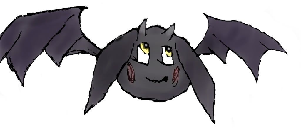
My first time Photoshopping a pic!!!What a bitch!! Photoshop is a pain in the ass for noobs like me. Thakn God Google was there to learn me a bit...lol. Anyways, this is just a test session for me. Once I draw a few more in pencil and get rid of the lines, itll be smooth. /wave "Hi Toki!" 
|
|
|
|
Post by Koach on Feb 5, 2008 0:58:43 GMT -6
LogofiedI didnt do anything fancy with the text...I am REALLY starting to hate that font though! LOL. I think I will try to find something else instead of the Chinese Restaurant Menu font!  
|
|
|
|
Post by Raenen on Feb 5, 2008 8:03:46 GMT -6
Looks nice man. seriously.
The font isn't THAT bad. It fits the theme. Either way, glad to see your stuff is coming along quite nicely.
|
|
|
|
Post by Kono on Feb 5, 2008 8:15:43 GMT -6
I don't like it being placed as the "O"...
First, the drawing needs to be more polished. Ain't hating, because I can't draw either, just saying.
I think that the two "Mascots" of Toki and Taku should be sitting on the ends, or on the T's. Being the "O"... Just looks funny.
|
|
|
|
Post by llael on Feb 5, 2008 17:06:11 GMT -6
Hmmm, Gramps? ..Aren't you that guy that was all like "Ive got some "HARD"ware for you to review....
IN MY PANTS!!!"
Lol yeah, I remember youuuu!
|
|
|
|
Post by llael on Feb 5, 2008 17:07:19 GMT -6
Ohh that looks great!
Neatttttttttttttttttttt!
=D
|
|
|
|
Post by Zyren on Feb 5, 2008 17:22:10 GMT -6
Does not understand what that had to do with the topic at hand, but oh well *shrug*.
Yea, it looks pretty nice. Like Kono said, just needs some polishing up and its purrty. I also agree with Kono when he said that Toki shouldn't be the "O"...cause now it just looks like "TokyTaku". But if you must keep him as the "O", then you should atleast make the white one the other "O" in "Toky". That way, people can get understand it easier.
And for the font, I think "Tokyotaku" should be outlined in bold black, and the words made a little brighter red to make it more eye catching.
This is all just positive criticsm. Please, no one through a fit over this.
|
|
|
|
Post by llael on Feb 5, 2008 17:44:32 GMT -6
LOL!
Page back, I was replying to Josh's 3rd to the last comment, and the hardware thing was when Josh was hitting on Billy. =P
LMAO. I can't imagine what you thought of that!
That's halarious.
|
|
|
|
Post by Zyren on Feb 5, 2008 18:33:48 GMT -6
Is that the actual japanese text for "Tokyotaku"? Or is that just some made up of stuff like that Douchebag guys tat on his arm? lol
|
|
|
|
Post by Sanjitsu on Feb 5, 2008 21:23:56 GMT -6
I agree, scrap the mascot being the O, or have it sitting inside the O because that just looks like Toky(mascot)taku
|
|
|
|
Post by Koach on Feb 6, 2008 0:29:05 GMT -6
I would like to shrink this one down a bit and throw it on the end of the Logo for Tokyotaku. I think if we changed the font up a bit, it would look pretty nice. I am trying to get at least 4 drawings inked up and scanned by this weekend so I can mess around with them in photoshop. I should have my Gurren Lagaan review done by then as well.  |
|
|
|
Post by RiCEADDiCTBOY on Feb 10, 2008 23:32:36 GMT -6
i have some logos and mascots...too bad my upload button is broken.  |
|
|
|
Post by RiCEADDiCTBOY on Feb 10, 2008 23:39:45 GMT -6
My first time Photoshopping a pic!!!What a bitch!! Photoshop is a pain in the ass for noobs like me. Thakn God Google was there to learn me a bit...lol. Anyways, this is just a test session for me. Once I draw a few more in pencil and get rid of the lines, itll be smooth. /wave "Hi Toki!"  for the billionth time...use illus...fuck it. lol. |
|
|
|
Post by Koach on Feb 11, 2008 11:45:12 GMT -6
WTF?! That picture I drew by hand...I find it damn near impossible to recreate using the tools in Illustrator. Unless I had one of those LightDraw Pads that let me draw on the comp, I dont see that being possible.
I did ink/scan/color the other pick above. Looks decent. I am going to detail it tonight and see how that goes.
Let me see what you've got Joe. If its anything like I am expecting form you, I dont want to be wasting my time when you can do it 100 times better, you know?
But, until I see something from anyone else, this what we seem to be doing in terms of mascot / logoish ideas.
|
|
|
|
Post by Seraph on Feb 11, 2008 13:06:18 GMT -6
It's coming along. Maybe you could put that little black rab-bat in an O. Sorta like Dreamworks with the kid fishing from Moon, but you could have "Toki?" Laying in the O? Either way for a mascot/logo, you're going to have to learn how to recreate that little guy in some kind of graphic editor. Even so far as to recording the lengths between lines. You could then make the left wing and copy/mirror it and make that copy the right wing for perfect symmetry. Looking at the image, you could retrace your hand drawn lines using the line tool and vertices you could round out. Honestly you're just a "retrace" from making that image look professional.  I just did a quick retrace on some parts using Paint.net (Never used it before but it's free open source and on my work PC), of course it'll take much more TLC to remove the hand-drawn look unless that's the look you're going for. The edges would need to be smoothed out and rounded, some of the lines thinned out, some recoloring, etc, but you're nearly at a finished product. But I'm sure you already knew all of that (not being sarcastic). |
|
|
|
Post by Koach on Feb 11, 2008 13:46:14 GMT -6
Hmm...never knew it was so easy. There are two things i am considering though.
One: If I am going to reuse the macot for anything but the logo (like other pictures or multiple logos), I am going to have to be able to draw him in different scenarios, shapes, sizes, stances, angles, etc.
Two: I need to learn more about coloring using PS (especially lighting). I found a couple decent tutorials which helped with the one you edited, but as I did the new one, it is a lot harder getting a consistent color palate and look to the character. The Toki in the new one I did looks almost nothing like the previous. If I am to remain consistent, I would need to save every color of every stroke almost (inkdropper becomes useless after the 3rd or 4th layer of coloring).
|
|
|
|
Post by RiCEADDiCTBOY on Feb 11, 2008 16:50:31 GMT -6
www.sitepoint.com/article/graphics-illustrator-freehandjust google searches for using vector in illustrator. you will get the result you are looking for josh. i cant do anything here..cause i'm on my dads laptop. would be so much easier to show you how if i was there...but, i'm not. illustrator is a great and powerful tool...if used correctly. most novices flock to photoshop for everything. but, thats why adobe offers more than one product. maybe i can take a webcam later and live stream myself doing something on illustrator...possibly toki and show you what i'm trying to explain.
|
|
|
|
Post by Koach on Feb 11, 2008 22:54:46 GMT -6
|
|
|
|
Post by Koach on Feb 11, 2008 23:35:22 GMT -6
|
|
|
|
Post by Kono on Feb 11, 2008 23:54:49 GMT -6
What do the random symbols mean?!?!
Other than that... Not bad at all.
|
|
|
|
Post by Koach on Feb 11, 2008 23:55:29 GMT -6
I just used a japanese font i downloaded and spelled out TOKI
|
|
|
|
Post by Kono on Feb 12, 2008 0:10:52 GMT -6
Awful idea...
That's probably WAY off... It probably says "Faggot" or something. ><
Looks nice though d00d. Keep it ^.
|
|
|
|
Post by Sanjitsu on Feb 14, 2008 17:29:45 GMT -6
Yeah, logo looks real good. Just needs some smoothing hear and their to make them more round and plump. But other than that ,I like it.
|
|
|
|
Post by ShowTime on Apr 10, 2008 23:32:50 GMT -6
|
|
om3ga
Full Member
  
Posts: 211
|
Post by om3ga on May 8, 2008 9:57:29 GMT -6
my 2 cents:
I like the idea of two opposing mascots (that's what you're going for, right?). I assume as much from the dark vs light, bat wings vs angel wings. Maybe add a halo and devil horns, or is that too much?
I would like the bottom one (toki or taku? I'm not sure which is which) to seem more agitated with the other one, maybe looking up and snarling. I like to imagine they have a vegeta/goku type relationship. One is a carefree and pure spirit while the other is cold and calculating.
Maybe give the white one's ears a more rounded/fluffy look like you did with the wings and keep the sharp corners/edges on the darker one.
sharp=evil
fluffy=good
I would like to see the ".com" disappear from the banner/logo. It kinda sucks all the fun out of it and serves no real purpose if you ask me.
|
|
|
|
Post by Kono on May 8, 2008 10:14:23 GMT -6
This thread hasn't had any action in awhile...
What ever happened to your idea, josh?
I thought you would work on it more when you got back home...
Guess you're too busy huh? LULZ
|
|
|
|
Post by Koach on May 8, 2008 10:53:02 GMT -6
Yeah...i dunno. It would be nice....
|
|
|
|
Post by Sanjitsu on May 8, 2008 12:51:47 GMT -6
Maaaan, you need to get the things you want done out of the way now. Before you regret it later in life. Last thing you want to do is 10 years from now go, "Man, I wish I did this and that more...If only I had the bawls to not be whipped" P It's not fun (This is me speaking from experience because I went through the same thing for 6 years). I lost a whole year Freshman year of college because of Crystal and I've regretted it ever since. I'm not saying you regret anything now, just thought I'd throw it out there. Cuz the website was a good/fun idea!
|
|